Autor/Autorin

The FRITZ BAUER FORUM continues to grow slowly. Now the cultural and educational centre for democracy and human rights is increasingly taking on its own face and profile. From January 2024, this will be expressed by our new logo with its own world of colours.
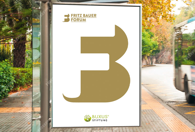
It was designed by Bochum-based artist Uwe Siemens . Here on the Fritz Bauer Blog, he describes what moved him to develop the logo and ultimately led to what we think is an exciting and dynamic design result. Some examples of this are shown in his contribution to the presentation of the new logo.
A website relaunch was also planned for 2024/25, because before the Forum 2025 can become a reality with seminar, event and office spaces, a magazine, shop and café as well as a garden area, the conditions for barrier-free participation and also for the most barrier-free bookings possible for our exciting and sophisticated events must be created digitally. And our growing film and document archive now also needs such access.
We will continue to provide information about this and it is worth checking our website regularly for new features and additions. (The editorial team)
From Uwe Siemens
The development of a logo for the FRITZ BAUER FORUM was more than just a graphic design project for me – it was an intensive examination of Fritz Bauer as a person and of the Forum. My aim was to capture the essence and spirit of this unique institution and to design a logo that is as catchy as possible and can unfold its presence on all media.
The monogram „FB“ becomes the creative centrepiece of the design, its curved shape conveying elegance and strength, dynamism and topicality at the same time. It symbolises the connection with the company’s namesake.
The deliberate use of positive and negative forms in the logo represents the multi-faceted perspectives and approaches of the FRITZ BAUER FORUM. The positive form emphasises the strength and determination of the organisation, while the negative form adds a subtle complexity and profundity. This duality reflects the Forum’s mission to address complex issues and promote multi-layered discussions.
The colour concept plays a central role, using broken colours to create a unique atmosphere. The shades have been carefully selected to convey respect, openness and a bridge to the past. These finely chosen colours are not only aesthetic elements, but also mirrors for the history and timeless relevance of the FRITZ BAUER FORUM.
The suggestion of a speech bubble as a communication symbol reinforces the message of the forum as a place of dialogue and open discussion. It emphasises the importance of communication in the exchange of ideas and values.
When creating the logo for the FRITZ BAUER FORUM, the artistic and conceptual challenge was not only to create a visual trademark, but also to tell a story. The resulting logo is aesthetically representative and can also be read as a symbol for the dialogue and the values that the forum and its namesake Fritz Bauer stand for.
December 2023